Executive BFF
This app was designed to be every executive's best friend. It aims to provide the most relevant pieces of information in any given context and enables execs to act upon the key performance indicators that matter most to them.

The Problem
Executives rely on many platforms of software in order to run the business. Understanding the big picture takes time and a lot of effort. Acting on KPI's is a cumbersome process. Time is the most valuable thing an executive has. A successful user journey should aim to make it easier to make wise decisions on the go.
My Role
I conducted the full stack design process on the initial phase of this project; user & competitive research, ideation, drafting, execution and several design iterations. Later on, when we got a green light from management, the design was expanded and prepared for development.
Visual Exploration
 |  |  |
|---|---|---|
 |  |  |
Persona

STANLEY KOHL
CEO at AMDOCS
STANLEY IS CEO at Amdocs. He likes to be int he know about every aspect of the company and currently struggles between countless apps and messaging services in order to stay on top.
STANLEY'S PRIORITIES:
1 Urgent issues are critical
2 External facing meetings
3 Internal facing meetings
4 Prepare for next meeting
5 IT status updates
STANLEY'S ACTION CYCLE:
1 Gather information
2 Prioritise
3 Delegate tasks
4 Request follow-ups
5 Repeat
Designing for Busy People:
Content is food for thought. It can be broken down into bites, snacks and meals, in order to be consumed easier.
I based the architecture of this product on a well known content writing and editing strategy. The idea is to give the users content in at least three forms, each a bit longer and more detailed than the previous. This method ensures that the most important information is getting across to the busy users quickly and efficiently.

BITE
MEAL
SNACK
Wireframes
Business based information architecture, the overall hierarchy was determined as following:
1 Urgent Messages (Always on Top)
2 KPI's on a company level (Bite)
3 Division View (Snack)
4 Account View (Meal)
 |  |  |
|---|---|---|
 |
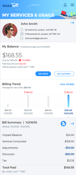
User Interface Design
This phase was about finding the balance between minimalism and clarity, which don't always work well together. The challenge was to distinguish and create a clear hierarchy between ever changing values and KPI's. This would be a mobile product, available to executives on the go. The interface would have to be clear and catchy.
 |  |  |
|---|---|---|
 |
What I Learned
Working with a high-level predefined goal is very useful. Start with something big like: "A successful user journey should make it easier for an executive to make wise decisions on the go".
Then break it down into factors such as: Seeing the big picture, prioritising information, delegating tasks and discussing topics.
These factors can be translated into features. For example, a key feature of the app is the ability to "request a follow up" or delegate a task to any given contact.
More projects I was involved in:


